Hot Spot button
A Hot Spot button is an invisible button. It is used to make an area of the screen "active". This means that you can respond to situations where the trainee clicks or moves the mouse over the area of the Hot Spot button. It is important to remember that the Hot spot button is invisible to the user, but is placed over an area on the screen which may contain another Action such as an image. Users are not normally inclined to click images or text unless you provide them with encouragement or request they click a particular part of an image. A Hot Spot button can be used in a number of ways:
To create a Hot Spot button:
A Hot spot button locator will appear on the displayed Lesson Screen and the Hot spot Button dialog will be displayed with the Hot Spot tab active. Remember that the Hot spot button is invisible to the trainee - the locator is displayed on the screen only during development of the Element.
|
|||
Dialog controls |
See The Interaction Toolbar for information about the dialog controls displayed at the bottom of the dialog box.
|
||
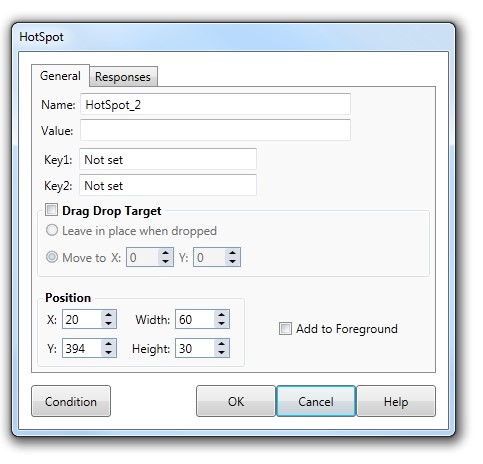
General tab |
The General tab of the Hot Spot button dialog contains the value and key properties that Check the Foreground check box make the button persistent.
|
||
Name, Value and Key(s) |
Function identically to those in the Custom button dialog, see Custom button for more information. |
||
Drag Drop
|
To make a Hot Spot button the target for a Drag Drop button ensure that the Drag Drop Target checkbox is checked. The two options within the Drag Drop Target frame determine how the Drag Drop button is positioned when dropped inside the current Hot spot button. |
||
Responses tab |
The Responses section of the Mouse Over tab contains properties that specify how the user interacts with the Hot spot Button.
|
||
Response
|
If the Click check box is checked the Lesson will move directly to the Response section of the Element when the user clicks within the Button. With the Drop check box checked, the Lesson will move directly to the Response section when the user drops a Drag Drop Object within the Hot spot button position. |
||
Mouse Enter/Leave |
With the Mouse Enter/Leave check boxes checked, you can provide feedback to the user when they move the mouse cursor over the surface of the Hot spot button and again when they leave the Hot Spot area by setting a different Value and handling this in the REsponse section. |
||
Examples of Hot Spot buttons |
See Response EXAMPLES for more information. |
||
